The five homepage sections that turn visitors into enquiries
Most homepages say everything and sell nothing. Here are the five blocks that do the work, in the order they should appear, with the wording that makes each one land.
The short answer
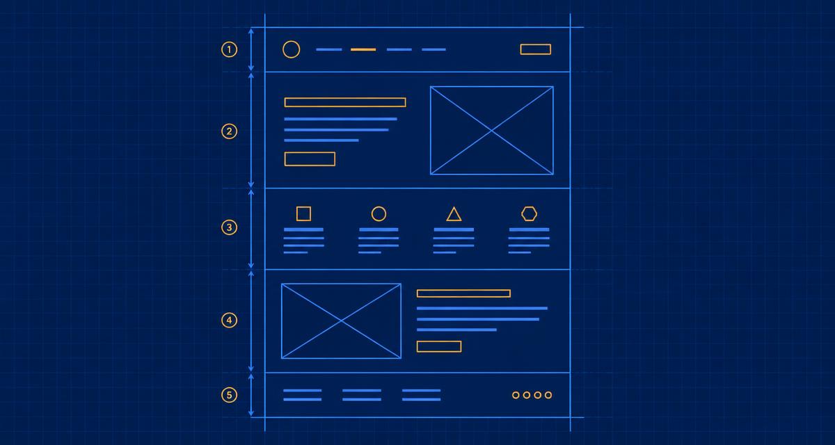
A homepage that converts needs five things in order: a headline that says what you do and for whom, a short explanation of the offer, proof that you have done it before, the specific next step, and an easy way to make contact. Anything else belongs further down the page or on another page entirely.
Visitors decide in seconds whether your site is for them. They are not reading — they are scanning for evidence that you solve their problem. Five blocks, in this order, answer that.
1. A headline that names the customer and the outcome
Not "Welcome to our website". Not "Excellence since 1998". Say what you do and who for.
- Weak: "Quality solutions for the modern home."
- Strong: "Emergency plumbing across Leeds, usually on site within two hours."
If a stranger cannot repeat your headline back to you, rewrite it.
2. The offer, in three lines
What you sell, what it costs or starts at, and what happens when someone gets in touch. Hiding prices makes people leave and compare you unfavourably with the competitor who published theirs.
3. Proof, close to the top
Proof is anything that says somebody else already trusted you: a photograph of finished work, a named review, a client logo, a number you can stand behind. One specific line beats five vague ones.
"He rewired the whole shop over a weekend so we never closed." — named customer, named town.
4. The next step, stated plainly
One primary action per page. Decide whether you want calls, bookings or enquiries, then make that button the loudest thing on the screen and repeat it at the bottom. Two competing buttons halve each other.
5. Contact that takes ten seconds
A tappable phone number, a short form with three fields, and your opening hours. Every extra field on a form costs you enquiries.
The order matters more than the design
A plain page in the right order outperforms a beautiful page in the wrong one. If you only have an hour, spend it on the headline and the proof.
A quick self-test
Open your homepage on your phone. Without scrolling, can you answer: what is this, who is it for, why should I believe it, and what do I do next? If any answer is missing, that is your next edit.
Common questions
- How long should a homepage be?
- Long enough to cover the five blocks and no longer. For most small businesses that is one screen of hero plus three or four short sections.
- Should I show prices on my homepage?
- Show at least a starting price or a range. Buyers filter on price whether you publish it or not, and hiding it usually loses the enquiry rather than winning the conversation.
- How many buttons should a homepage have?
- One primary action, repeated. Secondary links can exist, but they should look quieter than the main one.
Want this done with you?
Start with the free blueprint — answer a few questions and get the plan, the tools and the costs for your own site.
Newsletter
New posts by email, plus a free blueprint
Subscribe and we'll send you our free website blueprint — the pages, content and tools your site needs — then every new post as it's published. No noise, unsubscribe any time.